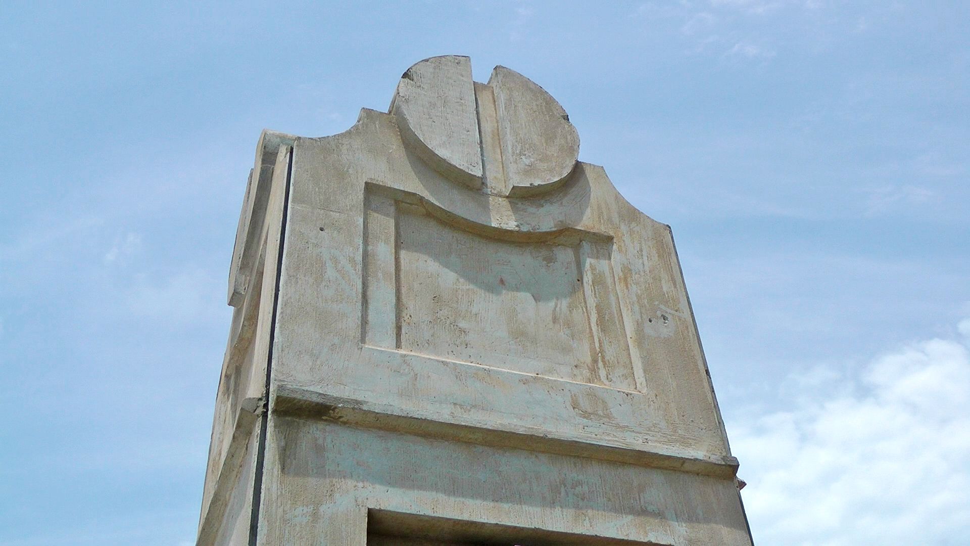
Anyone else think those "retro" columns would look better with polished smooth concrete instead of rough? You can really tell close up. It's at 3:45.
Anyone else think those "retro" columns would look better with polished smooth concrete instead of rough? You can really tell close up. It's at 3:45.

Thanks for posting the pic & vid (over in Steve's blog too)!
Possibly but I really like the retro look that I have seen in pics (i sometimes have browser issues with video). How noticeable is it while driving at normal speed? Granted there will be some foot traffic which brings us to the next question: I would think grafiti(sp) removal would be harder with a rough surface?? Overall I think they did a good job on it!
Thanks as always, William.
Looks like they *still* don't have that old postal facility demolished! Good grief, it's been months.
I really like the detail shown here on the Western bridge:

I almost did video of the postal facility, but figured nobody would care. I drove down the side, the front, and behind it. The front is definitely still there, untouched. The backside looks like it was hit by a missile. There's a huge rubble pile stretching for most of the area behind it.
Yes the detail on the already completed Western bridge is pretty amazing. As many times as I've walked past that bridge doing time lapse, I didn't bother to get video of it. I just assumed everyone here has already noticed it. The south side of the highway has this crimson/cream colored brick pattern. The red bricks are raised up with sides on them, as opposed to flat. The north for some reason lacks nearly as much detail. There are patterns in the concrete along the plain wall, as seen in the video.
Better pictures...
Robinson Bridge. Looks like it will be done fairly soon.
Decorations I was talking about.
Oh... and here's the rough columns.


Purely conjecture on this one about the north side not having the detail that the south side does may have been intentional as to not detract/compete with the DT view? Is there much to look at on the South side??? Not a slam in any way and hard to imagine someone with a highway dept thinking aesthetics (but I give them "2 thiumbs up" on the retro columns and some of the details I have seen in various construction (like the buffalo north of DT along), the designs in the intersection somewhere up that way...similar to the Project 180 stuff)

Ooooo, close up the Retro tower is rather rough looking (being charitable). Hope either they aren't finished with it yet (but since the bridge is open), or that it weathers/ages well. But may not have been intended to be viewed closeup and for more than a passing glance (but then there is the sidewalk thing). So I don't know.


It wasn't a complaint per se, as I stated except for the sidewalks, I would imagine it wasn't intended to be looked at up close and stand still (but at a decent rate of speed and at a relative distance). I really liked the design but all the pics I had seen were from a distance.
There are currently 1 users browsing this thread. (0 members and 1 guests)
Bookmarks