

i just hope the away jerseys are not orange. how awful would that be? or red.

 Participating Member

i just hope the away jerseys are not orange. how awful would that be? or red.
Participating Member
The more I look at it, quite honestly, it almost has a 60s-era sci-fi vibe, like the Jetsons or Star Trek. The dorito reference is classic, though.Originally Posted by metro

 Participating Member
Excellent pictures Doug. Thanks for posting those.
Wait until you taste a Thunder shot. mmmm. I'm sold on those.
Someone had the perfect saying last night, they said our logo was very centennial and I could agree with that. Looking at all the logos together, I agree that it sits in the middle. It's not the best but it's not the worst in my opinion either. I do think that some of the designs coming off it for future merch is fantastic and I think you guys will be happier as well.
VIP Member
I think it sits toward the bottom witht he only obviously worse ones being the T-Wolves (at least it has a wolf and a forest) and the Wizards (they cut their own legs out by naming themselves the wizards anyway).
Participating Member
Participating Member
After watching the clips of the announcement...P J needs help..Clay, get him lasik (either take the glasses off or wear some decent ones up where they belong)..and a makeover wouldn't hurt...and work on that voice...geeze! Oh, and Clay you look fine for now.
p.s. who were the kids?
Poster
Everyone needs to chill!!!
This is a new team, reborn, give them the time to grow!!!
Embrace the team, stop being paranoid and vomiting over the logo and colors!!!
The more this team plays, their identity will develop. There will be changes along the way. Ya all just need to start behaving and support the team.
Wasn't the mascot announced? If not, then they are still sorting it all out. At least we got something for now in time for the season. If they are still discussing on the mascot, then chances are they are still discussing the colors, theme, and logo to match up with the mascot.
If ya'all gonna keep on complaining, we're gonna lose the team!
Participating Member
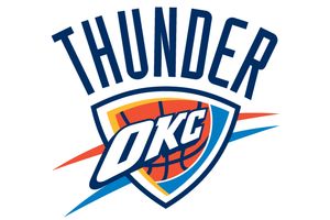
I will say that the logo is kind of weak. It's like they designed it before they knew the team name or anything about OKC, so they just stuck "THUNDER" on top of it at the last minute. I'm fine with the colors-- the shades of blue and orange compliment each other nicely --the logo itself is just...generic. It doesn't really symbolize anything.
In light of this, I hate to think what people in other states are saying about Oklahoma right now, heh.
Participating Member
Wow, I would have expected better from such an international firm such as locally HQ Ackerman-McQueen. Someone needs to prepare speeches for him as he's obviously not a great public speaker.
The Oklahoma City team worked with the Ackerman-McQueen agency and the NBA to develop the logo.
We are thrilled with the creative design, Bennett said.
It's hard to keep a secret, but we are proud of this, Bennett told the crowd inside Leadership Square.
Bennett was a little disappointed the logo's image leaked out last weekend but said that was part of the adventure. (why didn't you at least take advantage of this opportunity??)Im surprised there were that many people here, Bennett said after the program. Its great they want to be a part of this.
I thought it was great fun. Maybe I have a warped sense of things, Bennett said. I thought it was a lot of fun. I was disappointed in the image being released.
That left Bennett somewhat surprised that hundreds of people still showed up in the atrium of Leadership Square, watched from their office windows or leaned over a second-floor walkway to hear it for sure.
Theres just all kinds of good thunder images and thoughts, and the in-game experience of Thunder, Bennett said. Just here was a good sense of how that evokes emotion. Its very powerful.
(what does this mean and how does that reflect Thunder in the logo)
Desmond Mason's true thoughts without saying them? (of course he has to be positive since he's on the payroll and trying to establish a brand, but this isn't saying much since everyone knows the Jazz, Magic, etc. are the least liked logos in the league).
Its very unique, said Mason, a former Oklahoma State forward who the Thunder acquired in an offseason trade with Milwaukee. Its going to take some time getting used to, just like Utah Jazz or Orlando Magic, but I think its a great thing for the state and a great thing for the city.
My family talked about wanting to come down, and I said, `Well, I dont think its that big a deal. Everybody seems to know the name already, Bennett said.
Participating Member
I hate the Thunder font, but I still bought a black hat yesterday for the hell of it. I was so agitated with the THUNDER font that I actually painstakingly took off the Thunder and left the logo. I think they did a decent job with the logo. PBC took a serious risk by inserting OKC. It reminds me of the KC Chiefs logo or even the NY yankees logo where the main emphasis is KC or NY and not the name of the team. This seems like something for the long haul, where they will eventually drown out the nickname and replace it with OKC.
Participating Member
The Phoenx Suns hav PHX on their logo.
Participating Member
Participating Member
I think everyone needs to take a step back and remember whats important.
1. Better to have an NBA team, then not to have an NBA team.
2. There are better logo's, and there are worse. At least we have OKC in it.
3. As the team grows and takes on its own personalty, the opinions will change as to what the logo should represent. A generic logo gives us that chance to develop.
4. Who cares what every one else thinks. We spend way to much time worrying about what every one else is saying. Action speaks louder then words.
Problem is we just don't have anything else to talk about, and we have way to many back biters. We've got all this crap out of the way, like it or not we have a team name and a logo, complaining about them will not change them.
So lets start talking about basketball....and ....football. Go Sooners....Go Polks......Go Thunder....
Participating Member
So what your saying is that we should support the team in spite of the logo and colors?
Thats an excellent marketing point.
Me, I would rather have it both ways. Where we have a team we support, and a logo that inspires people to support the team as well.
This logo and color scheme will definately not pull in the masses that was not initially a supporter.
Participating Member
Definitely a "shield" theme going on. Mods please feel free to resize the images to a consistent size if you wish.


Participating Member
I don't like the lettering for Thunder on the logo, but the fact is there are other logos in the NBA that I consider worse then this one. Rarely do we get things both ways.
We just need to wait to see what the uniforms look like, that is what will draw people, and the product on the court.
For my part I like the colors, so far, and I like having OKC in the logo, logo looks kinda like an arrowhead. I can live with this.
VIP Member
For those that haven't seen it yet, it does look quite a bit better on the merch, esp with navy blue background.
Participating Member
why don't know body never start discussions in the right discussion threads?
Participating Member
I won't disagree that the logo could have been better, but I have to say I find it somewhat appealing, yet I do have a few major issues with it. First, the wordmark is terribly disproportionate in size to the graphic. Second, if the red-orange represents the Oklahoma soil and the blue represents the blue sky, then why is the blue on the bottom and the red-orange on top? Third, the unbalanced position of the shield's interior within the blue border makes little sense and is a bit distracting.
On the positive side, I'm thrilled that "OKC" is taking a prominent role in the logo. Overall, I think the logo gives off a retro, space-age vibe which I happen to be a big fan of. Any variation on the lightning bolt theme would have been trite and cliche, not to mention difficult to execute without the inevitable comparisons against the San Diego Chargers and Tampa Bay Lightning. To be candid, I have to wonder whether this logo may have originally been concepted for the "Wind" team name.
All in all, not a home run (or buzzer beating, game winning 3) but still a decent logo. I've ordered a short sleeve and a long sleeve T to celebrate and can't wait to wear them around St. Louis as I root on the Thunder from afar.
VIP Member
I'd put the odds on away unis being Strong Blue (as the lighter shade of blue was tagged on merchandise). Home white, of course, and possibly the yellow as an alt.
Participating Member
I would hope blue for home, and black for away. The logo on black does look pretty cool.
Participating Member
The logo is really boring. I don't understand it at all. I'm just really confused as to what the person who designed it was thinking. Lazy or what? Let's just take the colors from the flag and some dirt and wham! Team logo. And we got to put thunder on it. Come on man. It's lame and I think everyone knows it. Even the ones' who say they do. I can't blame anyone for trying to make this positive but lets just be real for a moment. It's horrible and embarresing. Looks like they didn't even try. We need to worry about what people think too. I'm so sick of people talking down on us because this state can't seem to get with the times. Clay had our hopes up with this and let us down. I just hope he reads these comments and wants to fix it because I really am greatful that we have this opportunity but why not make the most of it. We can't sell ourselves short on this.
Participating Member
If you all haven't read the horrible reviews and laughing stock articles about the logo on Yahoo, ESPN, Page 2, etc. Then check out the logo's they are posting on these internationally hot websites:
I wish it didn't come down to this really, why couldn't have Clay and Ackerman have used a focus group. Again, ad agencies aren't good designers and good designers aren't good advertisers.
Participating Member
LOL... I saw those...
Unfortunately, the KFC one is pretty funny...
*sigh* I'm trying sooooooo effing hard to be positive.
Participating Member
If you want to get real, then here's some reality: Okies talk themselves down as much or more than other states do. We ARE with the times. That's why we're picking up a professional team while Seattle is losing one. It's why Oklahoma has done pretty well with energy prices and housing values while much of the rest of the country is tanking. We're moving in the right direction on many fronts. It's our attitude that needs work.
There are currently 1 users browsing this thread. (0 members and 1 guests)
 Posting Permissions

 Reply With Quote


Bookmarks