Widgets Magazine
Page 3 of 5 FirstFirst 12345 LastLast
Results 51 to 75 of 119

Thread: Oklahoma City Thunder!!!

  1. Default Re: Oklahoma City Thunder!!!

    Quote Originally Posted by Karried View Post
    I think the Ford Center will look really cool when we're all wearing the Blue jerseys ....

    I have to admit, I'm trying to figure out what the orange and blue streaks through the triangle represent.

    Anyone know?

    I'm feeling soooo badly for the people who designed this logo, reading some of the comments on this board, newsok and Yahoo, I know they are feeling pretty horrible too.

    I expect it from the haters in Seattle but I didn't expect it as much from Oklahomans... oh well, I'm hoping the dust will settle.

    I'm not going to let it ruin my excitement. There's waaayyy more to a good team than colors and logos..

    I loved the Hornets beyond all reason and they had Purple and Teal for their colors, a Blue Insect as their logo .. and a giant blue bug as a mascot, loved Hugo to death, go figure.
    Karried! Long time no see. At first, I wasn't taken back by the logo. But when I began to think about the colors and what they represent, I began to realize how much of an emphasis was put on Oklahoma symbolism. The sky blue background represents Oklahoma's big blue sky, the same color on the state flag of course. The orange and blue streaks symbolize Oklahoma's sunsets, something each Oklahoman holds near and dear to our heart, and something Oklahoma is secretly known for.

    Go Oklahoma City Thunder!!!!

    For those who don't like our team name, I have two words... Houston Texans.
    Continue the Renaissance!!!

  2. #52

    Default Re: Oklahoma City Thunder!!!


  3. Default Re: Oklahoma City Thunder!!!

    LMAO.

    OKC DORITOS!

    I'd eat 'em up!

  4. #54

    Default Re: Oklahoma City Thunder!!!

    Great team, wonderful and skilled GM, promising future - these are the things that come to mind when I think of this team.

    I will be ready to yell to the fullest extent of my own capabilities on game night. I am ecstatic that we have our own team. But that logo is too simple. Simple is fine, but it should look like more than a few weeks was put into it.

    From what I've read, Thunder was decided back in July. If that is the case, there is no excuse for this thing. It is far too plain, and while I can enjoy some symbolism, I don't want to feel like a walking encyclopedia who has to explain said symbolism to the vast numbers of out-of-state people who will not understand any of it.

    I don't hate the colors as much as I did before, but this logo is absolutely abysmal. I'm sorry, but that is just my opinion, and apparently I am in the majority on this sentiment.

    I will follow this team as fervently as I do my beloved Sooners, but this was a horrible letdown for what should have been the best day in the history of this city.

  5. #55
    MadMonk Guest

    Default Re: Oklahoma City Thunder!!!

    Quote Originally Posted by Karried View Post
    I think the Ford Center will look really cool when we're all wearing the Blue jerseys ....

    I have to admit, I'm trying to figure out what the orange and blue streaks through the triangle represent.

    Anyone know?
    Red (ish-orange) dirt, blue skies? Sounds like Oklahoma to me.

  6. #56

    Default Re: Oklahoma City Thunder!!!

    Quote Originally Posted by CrimsonOberon View Post
    Great team, wonderful and skilled GM, promising future - these are the things that come to mind when I think of this team.

    I will be ready to yell to the fullest extent of my own capabilities on game night. I am ecstatic that we have our own team. But that logo is too simple. Simple is fine, but it should look like more than a few weeks was put into it.

    From what I've read, Thunder was decided back in July. If that is the case, there is no excuse for this thing. It is far too plain, and while I can enjoy some symbolism, I don't want to feel like a walking encyclopedia who has to explain said symbolism to the vast numbers of out-of-state people who will not understand any of it.

    I don't hate the colors as much as I did before, but this logo is absolutely abysmal. I'm sorry, but that is just my opinion, and apparently I am in the majority on this sentiment.

    I will follow this team as fervently as I do my beloved Sooners, but this was a horrible letdown for what should have been the best day in the history of this city.

    Very very good. That is probably one of the best written and reasoned critiques of this whole thing. Too plain, too simple, too boring indeed. And to think, they had all this time...

    Oh well. go team. Just please, please make this logo better Clay...

  7. #57
    MadMonk Guest

    Default Re: Oklahoma City Thunder!!!

    The only thing that bothers me about the logo is that the font for "Thunder" is a bit plain. The rest if fine and just as good as any other logo in the NBA. I think it's just a case of everyone having their own ideal image in their mind and this doesn't match it.

  8. #58

    Default Re: Oklahoma City Thunder!!!

    Quote Originally Posted by MadMonk View Post
    The only thing that bothers me about the logo is that the font for "Thunder" is a bit plain. The rest if fine and just as good as any other logo in the NBA. I think it's just a case of everyone having their own ideal image in their mind and this doesn't match it.
    I think I can agree on that. I still would like some tie-in to weather - considering we have a weather-related name, it doesn't seem too much to ask - but overall I can learn to like the design. That is, if they get rid of that bland lettering. It really does completely drag down the entire piece.

  9. Default Re: Oklahoma City Thunder!!!

    Love the name.

    The colors give them plenty of options.

    I think the logo looks more like a arrowhead.

  10. #60

    Default Re: Oklahoma City Thunder!!!

    Oh jeez.. They made a car flag:

  11. #61

    Default Re: Oklahoma City Thunder!!!

    Have there been instances in the past where other team logos have changed over the years?

  12. #62

    Default Re: Oklahoma City Thunder!!!

    For the record, it looks better than I had first thought after seeing the ball leak. That said, it leaves a lot to be desired. It certainly should have something relevant to the name, and the fonts still bug me. It'll do for now, I suppose, and I trust that they'll develop it into something more appropriate with time. Oh, and also:
    I'll have some words for anyone I see wearing it at OU games.

  13. #63

    Default Re: Oklahoma City Thunder!!!

    Quote Originally Posted by Tackleberry View Post
    Have there been instances in the past where other team logos have changed over the years?
    This upcoming season, the Hornets will have new unis and a slightly different color.
    In the NFL and MLB, logo changes aren't as common as in the NBA, while not common, they do happen over time. For some examples, you can look at specific teams and their changes here:
    NBA Logos - National Basketball Association Logos - Chris Creamer's Sports Logos Page - SportsLogos.Net

  14. #64

    Default Re: Oklahoma City Thunder!!!

    I don't know if this has been made a note of but on Sportscenter they showed teams whose names were 'weather related' and how they performed in their inaugural season. The Miami Heat in 1988-1989 finished the season a dismal 15-67!

    TWENTY YEARS LATER EXACTLY.

    Surely our team will do better!!

    I hope to say this as much as I say 'Go Pokes'. GO THUNDER!!

  15. #65

    Default Re: Oklahoma City Thunder!!!

    Thunder is a powerful name. The strong logo defines that power. The brilliant colors identify that strength, and that power, of a Big League City, and a soon to be NBA powerhouse team. This trend-setting combination will soon be envied by NBA fans throughout the league.

  16. #66

    Default Re: Oklahoma City Thunder!!!

    Quote Originally Posted by andy157 View Post
    Thunder is a powerful name. The strong logo defines that power. The brilliant colors identify that strength, and that power, of a Big League City, and a soon to be NBA powerhouse team. This trend-setting combination will soon be envied by NBA fans throughout the league.
    Well said... Now pass the blunt.

  17. #67

    Default Re: Oklahoma City Thunder!!!

    For some reason it reminds me of 3D Danny.

  18. Default Re: Oklahoma City Thunder!!!

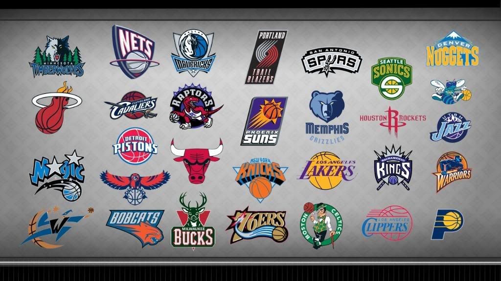
    Upon further research, I have come to the conclusion that our logo is not as bad as I think. It falls in about the middle of the pack:


    I must say I really dig Houston's logo when compared with the others.

  19. Default Re: Oklahoma City Thunder!!!


  20. #70

    Default Re: Oklahoma City Thunder!!!

    .oO(do the colors remind anyone else of the local fox news set?)Oo.

    Thunder turns out to be the perfect name all the same .... shoot, just listen to all the rumblin' that's goin' on.

    There's Thunder on the horizon! Saddle up and ride Claybois, saddle up and ride!

  21. #71

    Default Re: Oklahoma City Thunder!!!

    Quote Originally Posted by okcpulse View Post
    Karried! Long time no see. At first, I wasn't taken back by the logo. But when I began to think about the colors and what they represent, I began to realize how much of an emphasis was put on Oklahoma symbolism. The sky blue background represents Oklahoma's big blue sky, the same color on the state flag of course. The orange and blue streaks symbolize Oklahoma's sunsets, something each Oklahoman holds near and dear to our heart, and something Oklahoma is secretly known for.

    Go Oklahoma City Thunder!!!!
    That's just the point, though, isn't it. I've worked around graphics folks my whole 15+ year career. If you have to EXPLAIN the logo to the public it's intended for, you haven't done your job. The logo should speak for itself. This one does not.

    Please tell me how the colors and symbol relate to the name? They do not.

  22. #72

    Default Re: Oklahoma City Thunder!!!

    Quote Originally Posted by CrimsonOberon View Post
    I think I can agree on that. I still would like some tie-in to weather - considering we have a weather-related name, it doesn't seem too much to ask - but overall I can learn to like the design. That is, if they get rid of that bland lettering. It really does completely drag down the entire piece.
    I am with you C O. They really should consider having the 18th St. Lobos re-design their logo lettering for them. Those brothers turnout some badass script.

  23. #73

    Default Re: Oklahoma City Thunder!!!

    Rule number 1: If you're going to name the team the OKC Thunder or anything with the city name in front of the team name, then your logo should freakin' read the same way! So the first screw up is the fact that they put Thunder on top of the logo. Every other professional sports franchise has gotten this right. Not the Thunder OKC.

    This logo was a failure based on that point alone.


    Rule number 2:
    As someone already pointed out, if you have to spell out every detail of the symbolism, you've failed to do your job. The Thunder OKC logo referenced two other characteristics of Oklahoma weather (Sunsets and Blue Skies), without even referencing the phenomenon after which the team is named; the Thunder!

    Keep the blue from the Oklahoma Flag...get rid of the red dirt, the orange and the yellow and grab some silver, gold, black and white and get OKC a real logo!

  24. #74

    Default Re: Oklahoma City Thunder!!!


Thread Information

Users Browsing this Thread

There are currently 1 users browsing this thread. (0 members and 1 guests)

Similar Threads

  1. On calling the team Oklahoma City (?)
    By Laramie in forum General Civic Issues
    Replies: 76
    Last Post: 05-04-2008, 02:48 AM
  2. NBA: Welcome to Oklahoma City; please stay
    By scotplum in forum Sports
    Replies: 2
    Last Post: 11-02-2005, 03:37 PM
  3. OKC becoming quite a convention city
    By Patrick in forum General Civic Issues
    Replies: 3
    Last Post: 07-29-2005, 02:04 PM
  4. South Oklahoma City is on the grow
    By mranderson in forum General Civic Issues
    Replies: 24
    Last Post: 07-19-2005, 07:40 PM
  5. Another chance to improve city
    By Proactive Volunteer in forum General Civic Issues
    Replies: 4
    Last Post: 11-30-2004, 09:21 AM

Bookmarks

Posting Permissions

  • You may not post new threads
  • You may not post replies
  • You may not post attachments
  • You may not edit your posts
  •  
Single Sign On provided by vBSSO