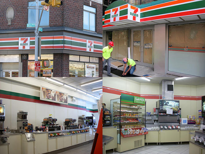
Fetid with grease, a wrinkled hotdog rotating endlessly underneath a dessicating heat lamp. The slime green nozzle of a Slurpee machine, clenching and then heaving its bowels into the bottomless maw of a Big Gulp. Sound familiar? All of these iconic hallmarks of the 7-Eleven experience might soon be a thing of the past, thanks to a new store redesign that attempts to emphasize healthier living.
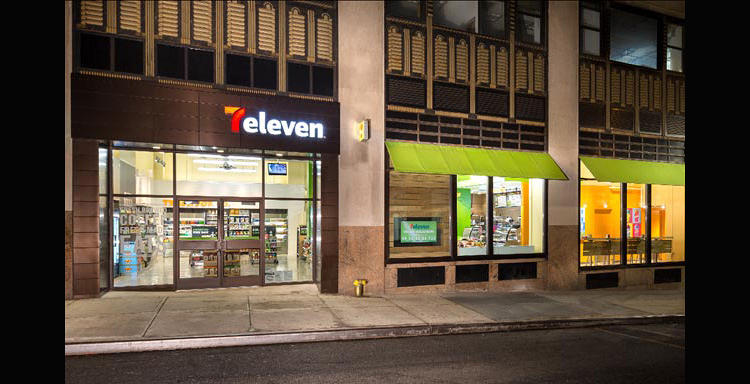
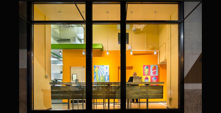
The refresh--which will eventually see a new logo and new look come to 7-Eleven's 50,000+ retail stores--was created by Dublin, Ohio-based WD Partners, who were tasked to "reposition and rejuvenate [7-Eleven]'s stores in order to better capture the millennial and female demographics." As opposed to the truck drivers, old ladies in housecoats, and kids on BMX bikes who were, perhaps, 7-Eleven's previous target demographics.
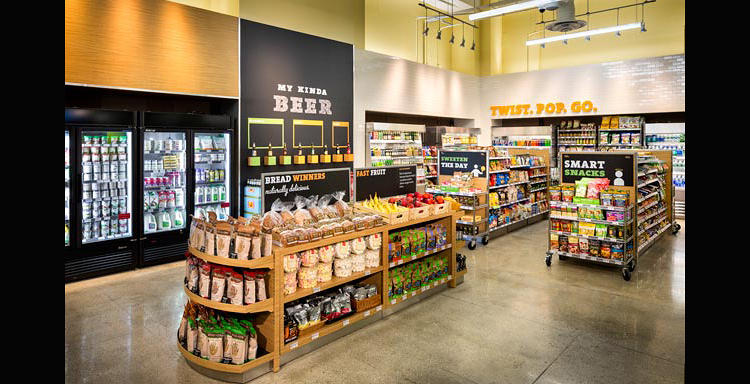
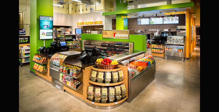
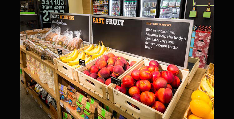
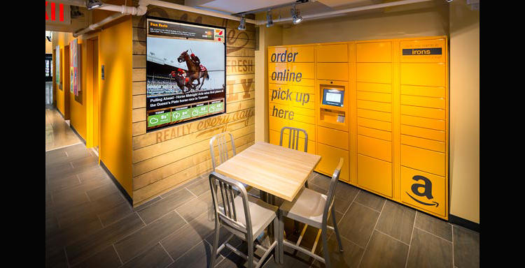
As for the store interiors? 7-Eleven looks like it's trying to distance itself from its unhealthy image as a purveyor of cigarettes, sugar, and grease. The new stores have an almost Whole Foods style vibe--or, if you've ever been in Japan, Famima!--with a layout and signage strategy that attempts to highlight healthier snacks and freshly made food over microwaveable nachos and sodas the size of a toddler's torso.
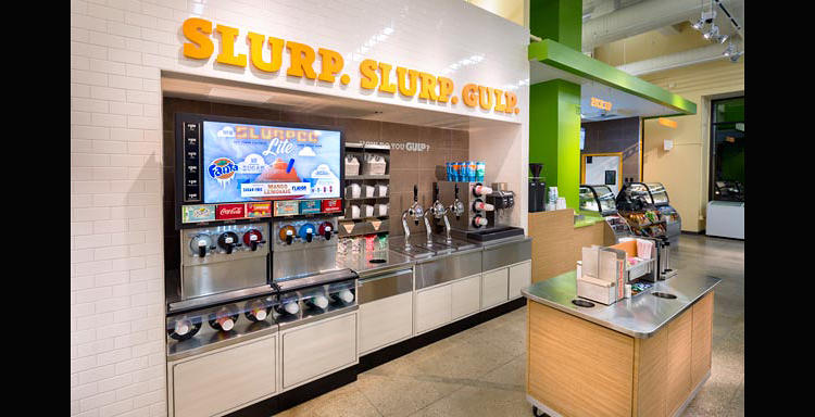
That's not to say that 7-Eleven is wholly turning its back on the past. Pay attention, and you'll notice from the photos that there's still a pour-your-own Big Gulp station underneath a sign reading: "Slurp. Slurp. Gulp." Nothing like transcribing the sounds of someone noisily chugging 1.2 liters of frozen gelatin syrup in 16-inch-tall cups to really appeal to healthy-living millennials, is there?



 Reply With Quote


Bookmarks