

Found this while searching flags, I've always liked flags and this got me all stirred up.
Your State Flag Stinks: Oklahoma


 Participating Member


Found this while searching flags, I've always liked flags and this got me all stirred up.
Your State Flag Stinks: Oklahoma
Banned
The original State flag looks pretty good.
Banned
Just for fun.
Gold Member
The best ones the country are all pretty close neighbors if not bordering neighbors, actually: AZ, CO, NM, and TX. Those are the top state flags, IMO. For a top five I would include AK as well.
Participating Member
I definitely agree with this, I just try not to let Texan's know.Originally Posted by Celebrator

I'm more amazed at home many flags are some shade of blue with some kind of seal or logo in the middle.
Participating Member
Yeah when I looked at all of the state flags (sorry krisb I know this is about city flags), I was amazed how BAD some of them are.
You gotta throw California's in there near the top, not really a fan of words on a flag but their's is awesome.
Participating Member
I think a lot of Oklahoma flags actually end up a bit too light with the blue. The color by law is Pantone PMS 285c, which according to the swap would be this (which I'm sure will look different on all our screens:
I would be okay with the colors on the tifo though, green for grass and blue for sky and tying it to the State flag.
Participating Member
Or green for the grass and blue for the flood waters.
Banned
As promised. I came up with this a couple of years ago. I used more colors than recommended in the video but they all came from the standard color pallet and have meaning. Most of the colors have multiple meanings and the flag as whole can mean different things to different people. The smaller triangle version could be hung on poles around downtown. The 5 color bar would be much smaller insignia on uniforms (police, fire, etc), kind of like military service ribbons. The red and blue would be the same colors as in the City seal.
White: Weather, heaven, spirituality, pureness, honesty
Blue: Open skies, aviation industry
Green: The land run, agriculture, spirit of the open west
Red: Indigenous population, relocated tribes, soil, earth
Black: Oil, energy industry, mineral resources

Participating Member
Nice scheme.
Participating Member
Kerry, That's actually a very nice job. Since we are a city that can be identified with three letters, and that's become more accepted ( for example, I hear network morning weather anchors use it all the time), how could "OKC" be worked into your design? I like how the flags with the city names can be sharp looking but instantly identifiable with the city. Dallas is a good example, but it looks a little dated with the official seal versus something forward looking. What do you think about the OKC idea? Here's a couple I like that actually have the names of the city incorporated in the logo.

Participating Member
Here's one I came up with:
The dark red diagonal represents the Cross Timbers that traverses across the metro. The diagonal then dictates a weaving pattern across the flag representing community, togetherness, close-knit. The pattern is also representative of Native America; patterns used in basketry, pottery, jewelry, clothing, etc. Within the pattern are four triangles, a significant number in Native culture (a significant number in general, IMO); north, south, east, west; up, down, left, right; the four seasons; the four times of day; the four stages of life; the four elements.
I don't think I'm feeling the color scheme quite yet, or if the letters "OKC" would look good across the flag.
Participating Member
This is really simple and I actually kind of like it. I feel like you could maybe get rid of the white though and still get the point across. Just a thought.
Banned
I'll work up another version tonight. I have sime ideas based on the feedback.
Banned
I moved the white to a horizontal bar because the characteristics it represents does/should transcend the other symbolic colors. I am also thinking of putting a star in the white bar to signify that we are the state capitol. On edit - scratch the star, it makes it look too busy.

Participating Member
I never really cared for multi-color horizontal/vertical bar flags because there are a ton of them already just at the country level, no one outside of the city will ever recognize them (granted few city's are recognizable already)
Banned
Are these outside the box enough for you?

The poster formerly known as cleanskull
Four basic elements, four basic colors. Simplicity.
 VIP Member
Well im so relieved that some douchebag created an entire website that tells everyone how dumb their flags are with no regard to what they actually mean to people. Let's all bow to this amazing insightful person and their skills with Microsoft paint.
Administrator


Banned
Ummm, what just happened?
Administrator
guess somebody really didn't like the 'your state flag stinks' website. -M
Participating Member
I'd change the tree to the Light blue of the state flag and think it would be a win.
Banned
This is just me, but I wouldn't put the survivor tree on the City flag. OKC is not defined by the bombing, the bombing was defined by the people of OKC. OKC is bigger than any one event (except maybe the founding of the City itself).
Banned
Okay, I see now. He was referring to the link at the top of page. Well, any time you have to write the name on the symbol of what the symbol stands for, you lost all the symbolism. That is a fail in my book. To go back to the original TED video, the US flag doesn't say United States of America on it.
There are currently 2 users browsing this thread. (0 members and 2 guests)
 Posting Permissions

 Reply With Quote
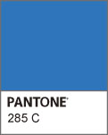


Bookmarks