https://twitter.com/dtOKCbuilds/stat...64286297108481
Me and my girlfriend tried Hobby's Hoagies yesterday and I didn't get any photos myself.
https://twitter.com/dtOKCbuilds/stat...64286297108481
Me and my girlfriend tried Hobby's Hoagies yesterday and I didn't get any photos myself.
They still have to work their way around the whole complex, but the area near the entrance is largely complete and looks miles better:
I'm not sure it looks that much better. The sketchup renderings looks considerably better than the actual finished product.
Now it looks like somebody TRIED to make it trendier, but had no idea what they were doing...
Come on Cuatro, its not up to Seattle standards but its good for OKC, especially since it was such horrid looking to begin with. I don't see a way they could have done any better without a complete redo that includes a new facade as well as changing the roof to a flat roof.
I'm actually going to agree with Cuatro on this. I'm not sure I really like it.


I think it is the peaked roof syndrome. For some reason it is very difficult to make them look modern and urban.
Also the grey sign or whatever that is, looks horrible.
I think the facade is dramatically improved. Whether one likes it or not is another story.
My thoughts...

It's allright, and definitely an improvement on the old design, but it just looks like a traditional apartment building you could find anywhere over the past 20 years.


From a distance, it looks good.
I like it waaaay better.
It's about the best they could do with what they started with.
Note they even square off the arches around the entrance. They are spending a bunch of money.


I know I've seen instructions somewhere before, but how do I post big pictures?


It looks much better in person than the old stuff.

nm


Such a great improvement

I think it would look better if all the paint was the darker color.
The biggest improvement will be with the storefronts along Walker.
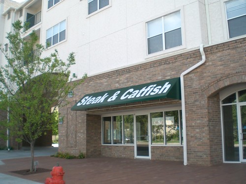
Those awnings with the huge, garish lettering were one of the worst design elements I've seen in new construction.
Lest people forget, similar awnings were all along Walker:

Went by this project and the renovation represents a massive improvement to the original design.
They've only completed one small section near the entrance because it looks like they are busy on the interior facing facades.
Clearly, the entire fake-stucco exterior has gone bad and they are completely replacing it.
Looking forward to the project being complete, especially the change-out of the retail signage.


The fact that they can afford to redo the entire exterior a fairly short time after opening shows that they are raking it in.
I went back to the beginning of the thread to see when this was completed, and I saw this (from 2006):
The fact that rents haven't been forced down shows how much demand there is in downtown OKC. I think it is interesting to look at our expectations in 2006 and see how things have played out.
They still have a very long way to go with this ambitious exterior renovation but the parts they have done look way, way better.
In the last picture, you can an example of how cheaply the original project was finished. We all know the main facades were extremely plain, but that's a photo off Walker that gives you a peak into the areas that aren't as obvious but where they really cheaped out. Not sure how this may be addressed in the remodel.

Which space did Patrono take up?
There are currently 5 users browsing this thread. (0 members and 5 guests)
Bookmarks